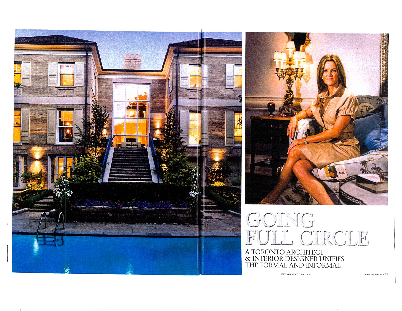
When designing for a client’s home, Dee Dee Taylor Hannah, of Taylor Hannah Architect Inc. in Toronto, says she explores “what is familiar to daily life, such as axis, symmetry, proportion and scale.” As both architect and interior designer, and co-owner of Montclair Construction, she was responsible for the creation of her home from the first design concept to the fully finished product.
Hannah’s axis, or central concept for her home, was a plan made up of two main areas on the ground floor-one formal and one informal-every space connected and flowing in a circle. Within that circle are points of interest, large scale and small, areas that stand out and others that are quiet and gentle. “Like music,” says Hannah, “I wanted the house to be a three-dimensional experience.”
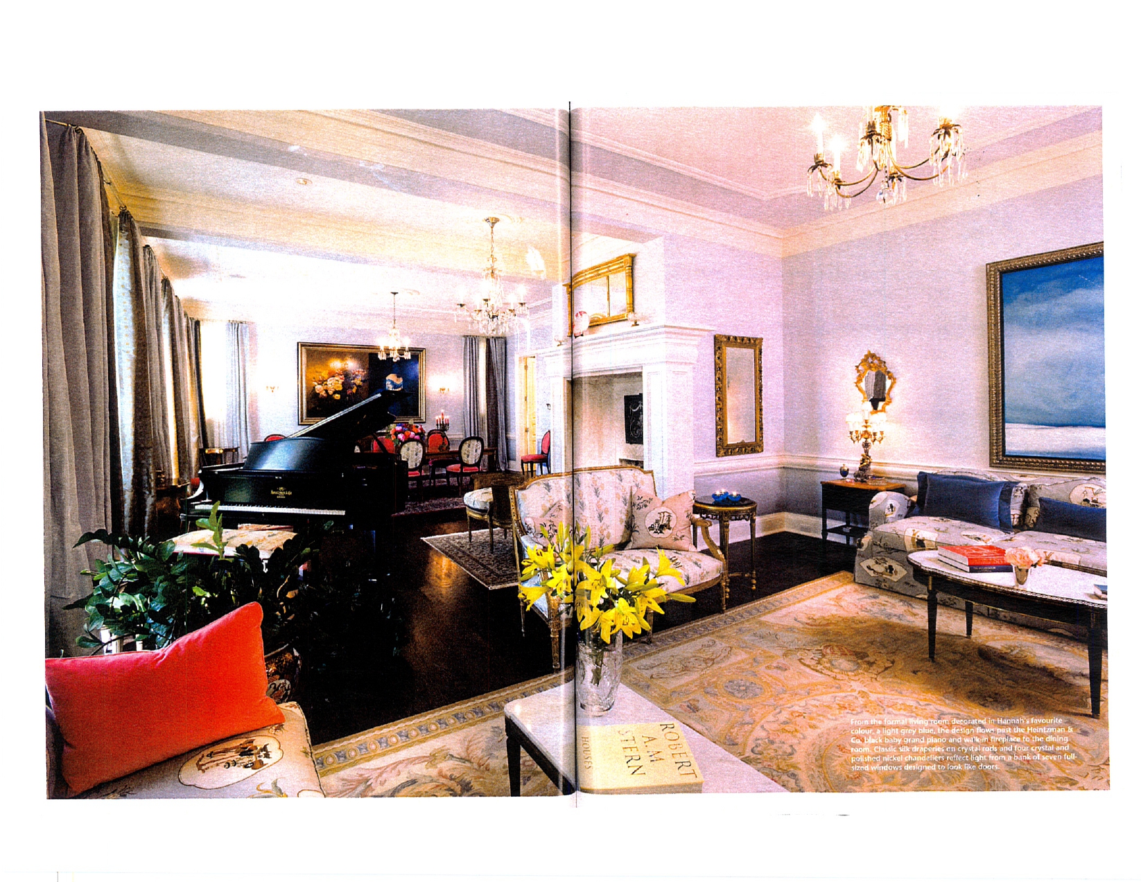
The formal space is open plan and 45-feet-long, comprising living room, dining room, and a room that houses a baby grand piano. Panel moulding on the nearly 12-foot high ceilings makes them seem even higher. What could have been a cavernous space is, instead, artfully broken up visually by building down plaster beams and applying plaster cornice. Although finished-on-site oak floors are installed throughout, area rugs-a Persian, a Tabriz and an Aubusson-define the space functionally. “Normally, you can’t put three different styles in one space,” says Hannah, “but because there is a fundamental architectural order to this space, you can do anything within it.”
Between the living room and dining room, an oversized, walk-in fireplace plays with scale and proportion and balances the piano. Along the south elevation, light pours in from seven almost 10-foot high windows designed to look like doors. Understated silk draperies in soft pinks, blues, and browns allow antique furniture and lighting pieces as well as large modern art pieces to take centre stage.
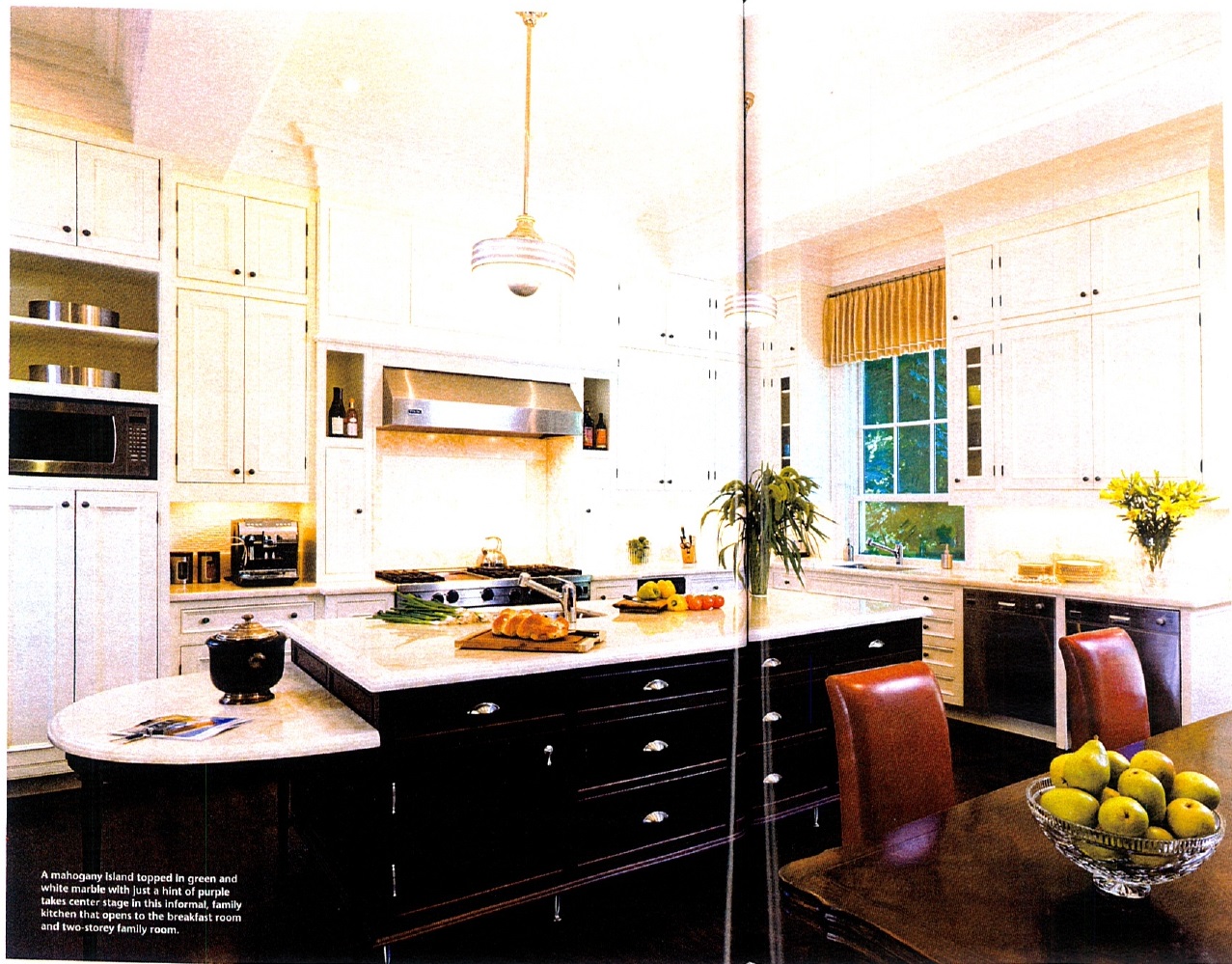
Flowing from the formal area, the informal space houses the kitchen, breakfast room and two-storey family room and is also open concept. The framed kitchen cabinetry with exposed hinges has classic Shaker style doors painted in light seahorse green, allowing them to blend into the walls rather than dominate. A large mahogany island topped in green-and-white marble anchors the room. A semi-circular drop-down table at one end plays again with symmetry. Stainless steel appliances and stainless steel legs on the island keep it informal and modern, and repeat the stainless steel leg detail on the sofas in the family room.
Although the home is based on Georgian architectural design, the foyer is set to the side of the building and a U-shaped plan creates a courtyard. “Style has to be a reflection of a person’s unique sense of themselves,” says Hannah. “I’m ever-changing. I love exploring new ideas and different ways of articulating architecture, and applying knowledge to those ideas, so I am continually growing.”
On the northern elevation Georgian influences play out with uniformly set windows and a central focus at the head of a sweeping stone staircase, but symmetry here is not predictable and boring. While there is balance and harmony, and beauty resulting from repetition, this design is also practical. The house is 68-feet-wide on a 75-foot-wide city lot, and there are restrictions on boundary-line windows. By building out the side wings, Hannah created additional inner faces for windows, so that each bedroom has windows on two sides. The resulting recess perfectly frames a massive central window made up of twelve full-sized windows mulled together.
The central window and walk-out basement take this 8,000-square foot, two-storey house visually to three floors. Yet the building does not impose on the landscape, but rather exudes elegance and an understated grandeur. The stone staircase breaks up the scale. Warm yellow-buff brick is accented between floors with Indiana limestone bands. The look is further softened with bricks that are smaller than expected with raked joints, coordinating copper soffits, shutters in muted shades, and a generously planted garden.
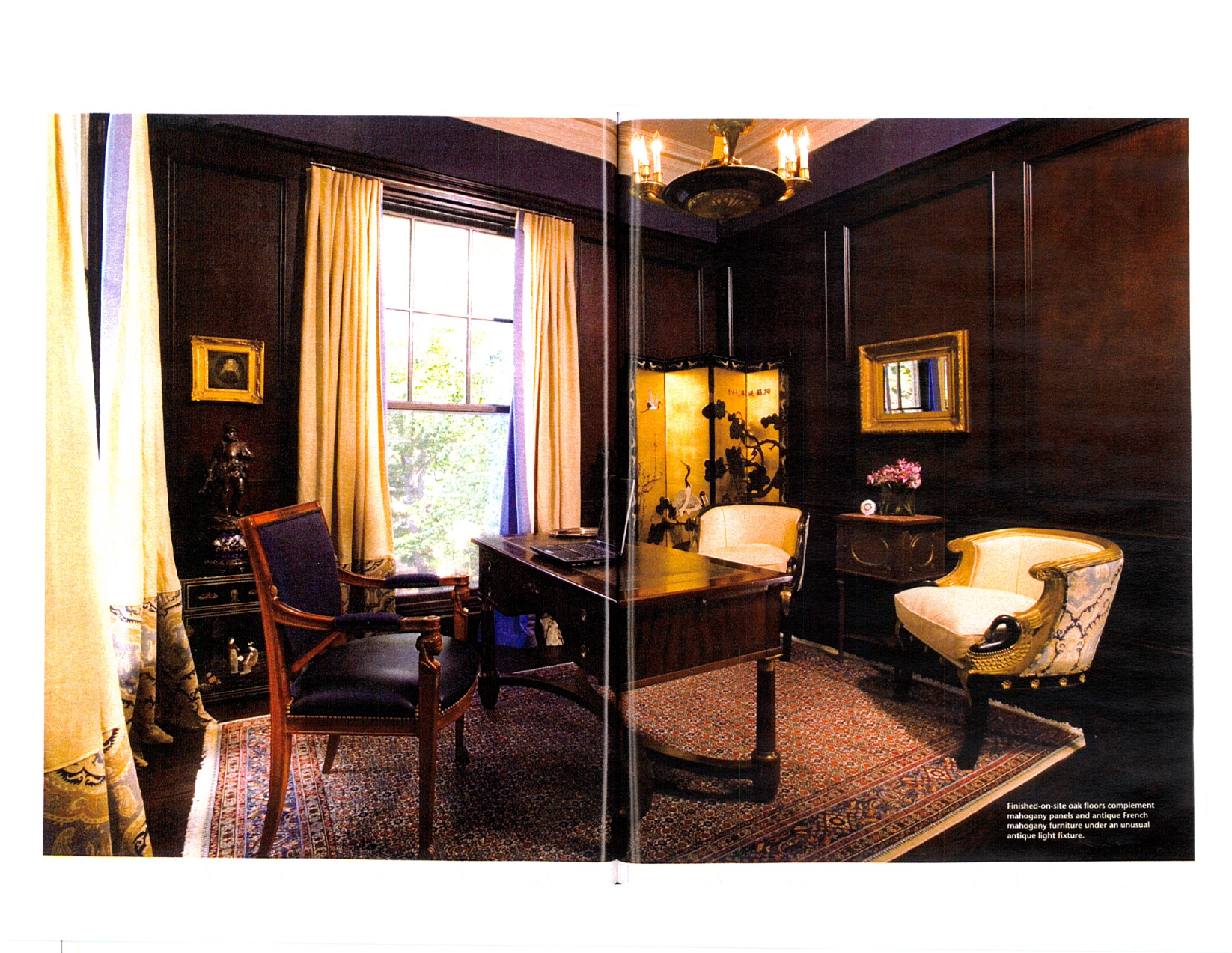
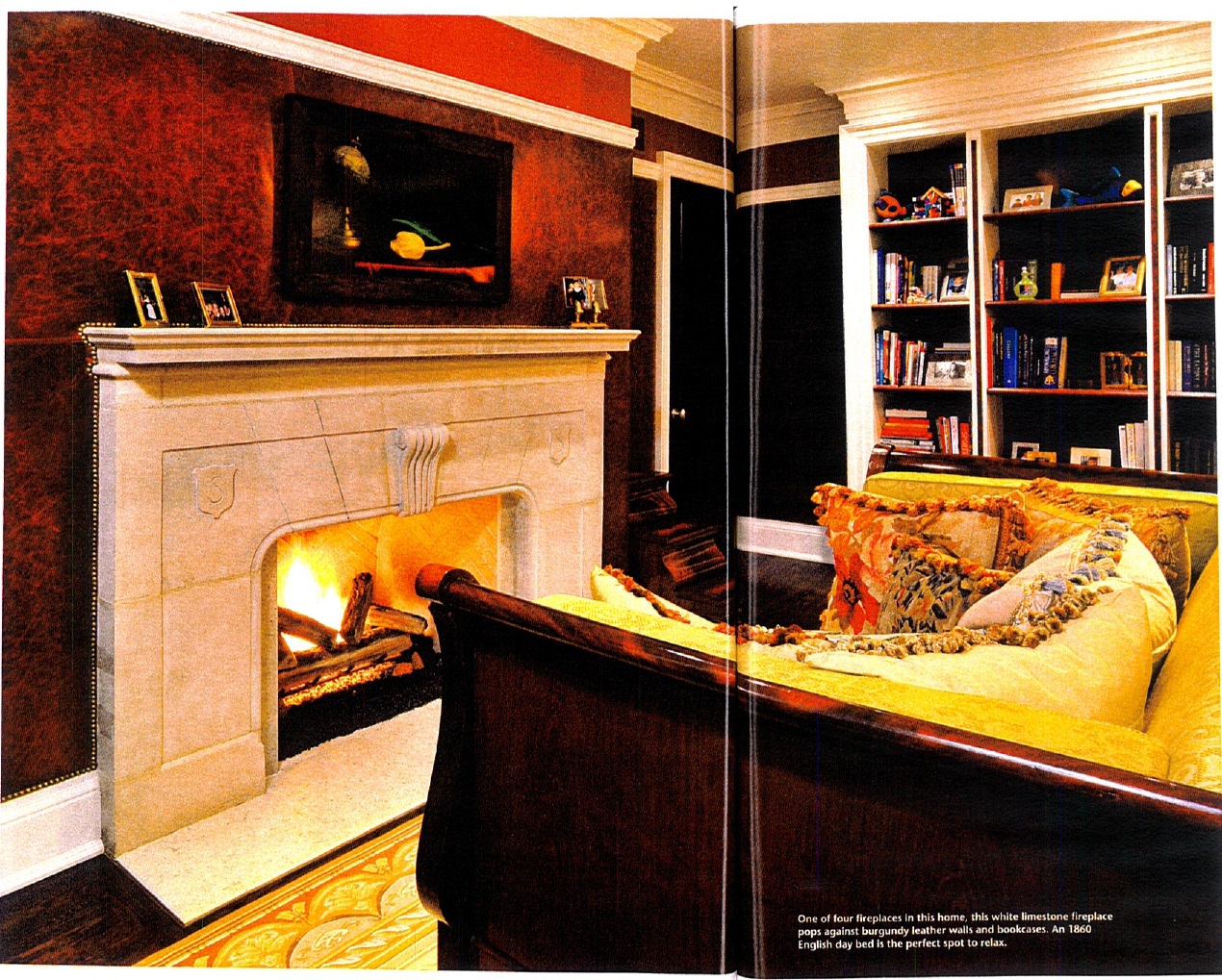
Despite its large scale, this house feels welcoming and intimate. The main floor office is paneled in mahogany and furnished with antique French mahogany pieces, while the second floor office features a white limestone fireplace set against a burgundy leather wall, all nail headed. Even the bookshelves are white and burgundy leather. A large 1860 English day bed balances the textured finishes.
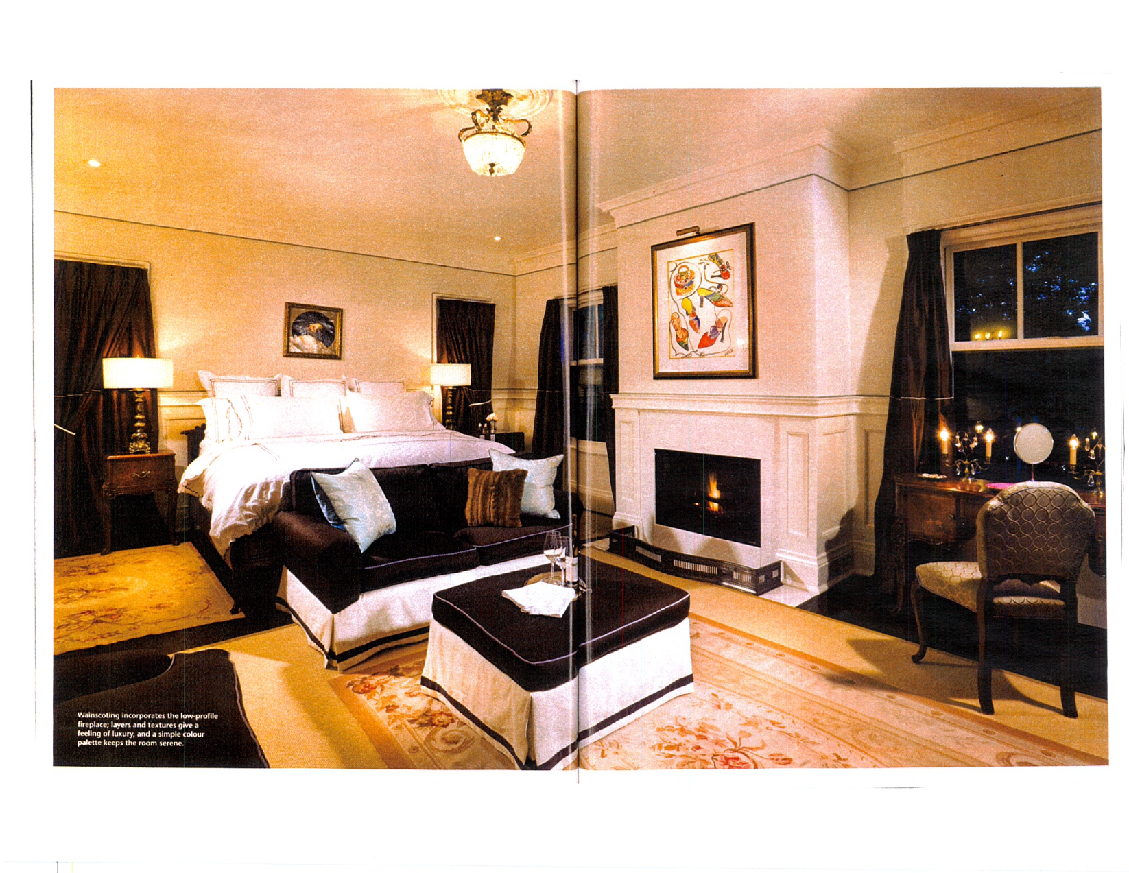
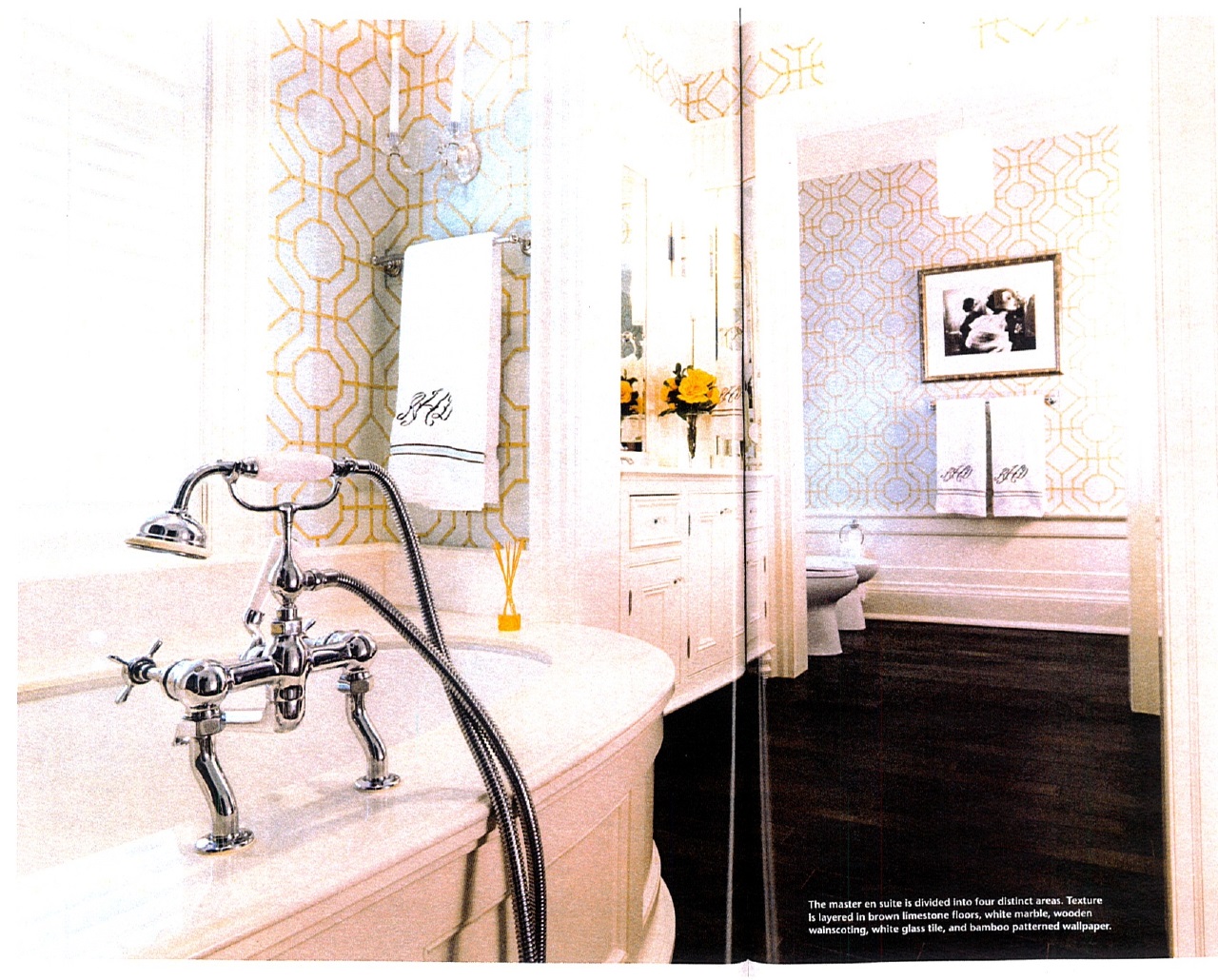
There are five bedrooms on the second floor, three with en suite bathrooms. The master bedroom is sleek and simple in brown and white. Wainscoting around the room incorporates the fireplace so that it is built in rather than being celebrated. White linen walls with just a hint of blue carry into the bathroom to an under-mounted white bathtub, white glass tiles in the shower room, and white Thassos marble finishes. Brown repeats in a brown limestone floor.
This is a city house, but it is not trendy and flashy. “Although only three years old, it is stately and has a presence,” says Hannah, “but it is foremost a home. The many layers of detail, from floors to fabrics, materials and finishes allow it to grow with the times”.
