1. Entertain large groups?
Counter seating and a floor plan that allows people to gather comfortably are ideal for parties. Large ovens and deep dual sinks are valuable if you often use catering services.
2. Decorating style?
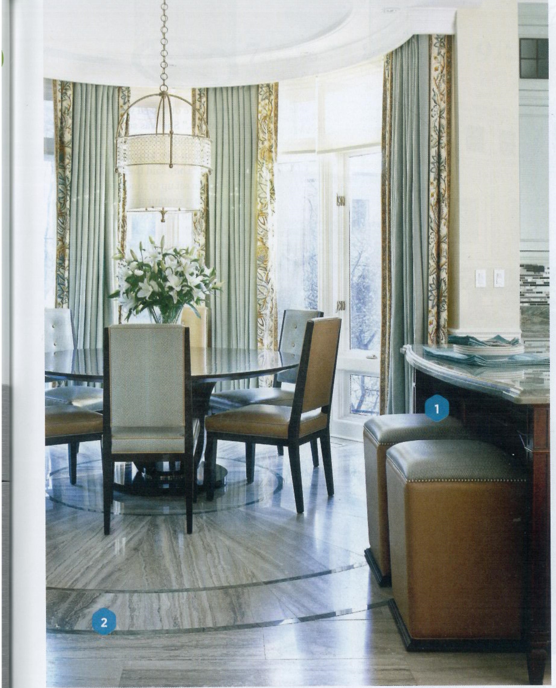
The kitchen’s interior design should blend with the rest of your home. Here, limestone floors flow from the foyer to the kitchen to the breakfast room.
3. Scrub loads of large pots?
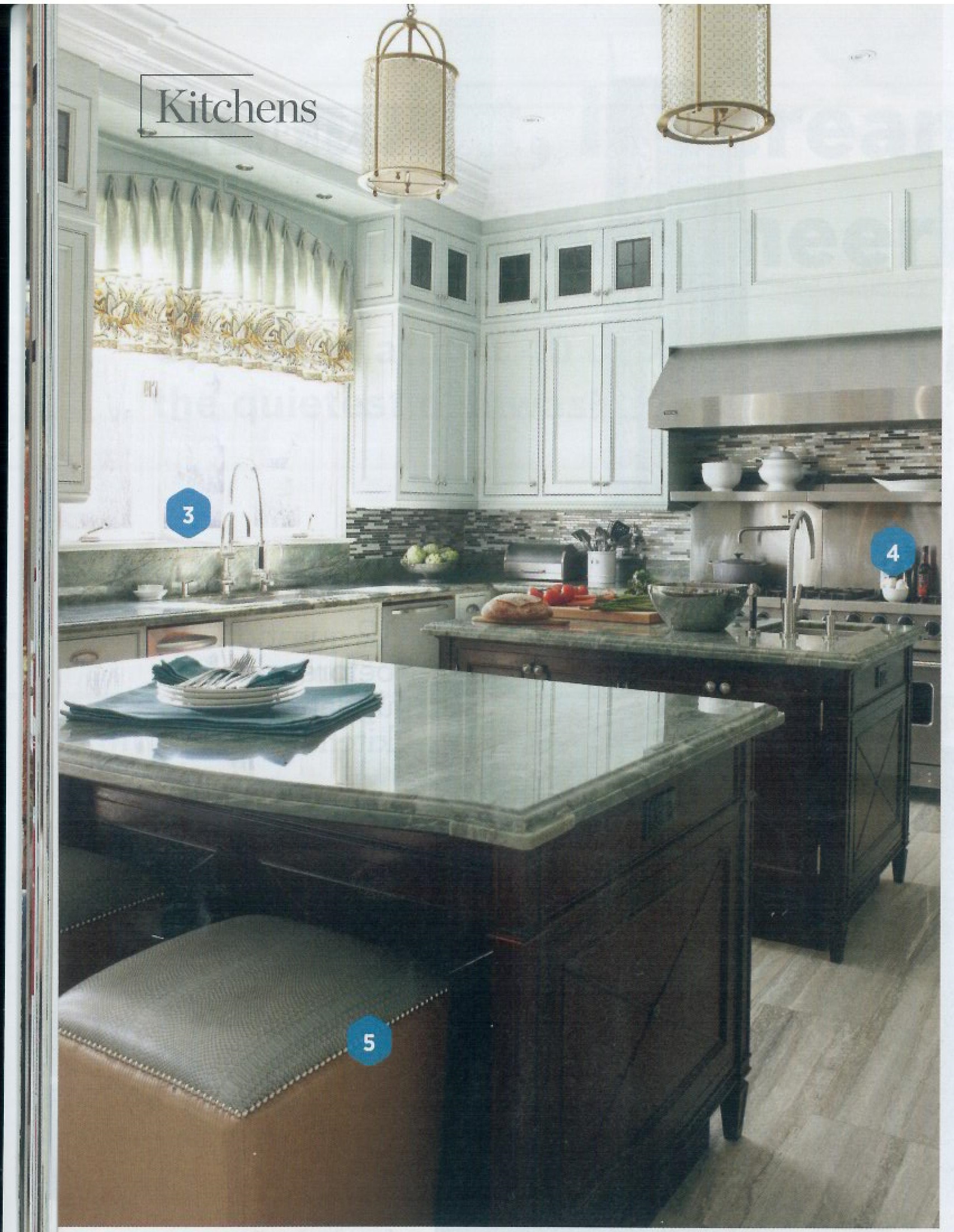
High-arc and restaurant-style spray faucets paired with deep sinks simplify washing big pots and pans. Add a pot filler above the range if you often heft heavy pots of water to the stove.
4. What kind of cook are you?
Serious cooks want pro-style equipment. If you rarely need mega power, look at some of the less pricey options.
5. Have kids and furry friends?
If children and pets fill your kitchen, opt for durable materials. This five cat and one Great Dane home went with vinyl on the stools and stone rather than wood on the floor.
6. Need to stay plugged in?
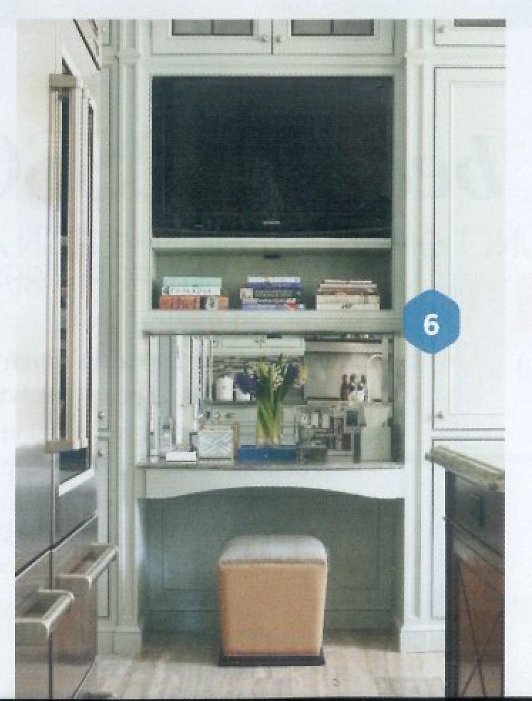
Linda Waks tunes into the Food Network when she’s in the kitchen. Having the flat-panel TV built in above the desk keeps it in view but safe from splashes and spills. The desk is also a landing spot for mail and papers that tend to accumulate in the kitchen.
7. How many cooks in the kitchen?
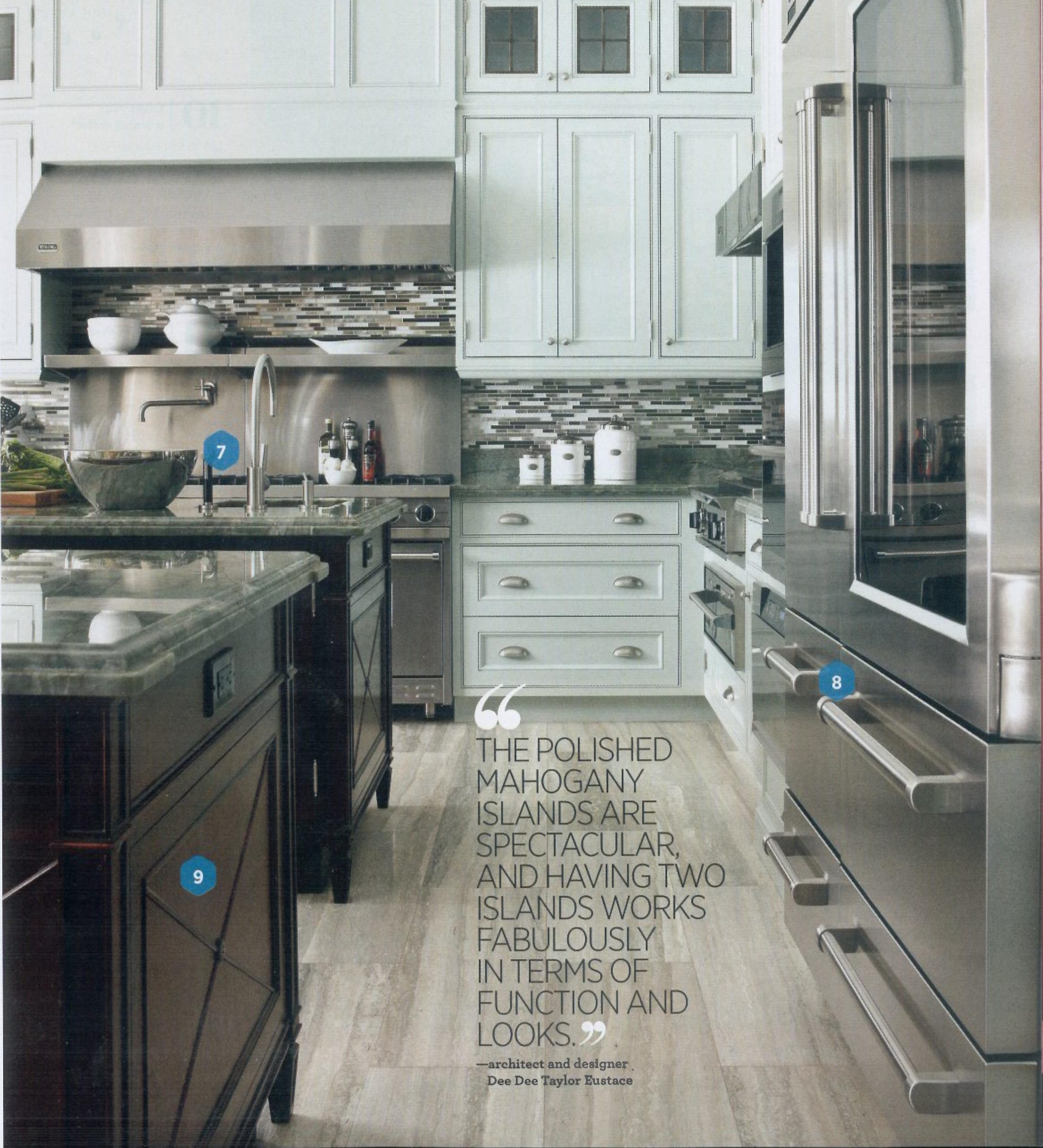
Allow plenty of floor and work space if there are multiple cooks working simultaneously. Two islands and two sinks create work zones where Linda and her daughters can share cooking chores.
8. Are you a neatnik?
Linda loves her glass-front Sub-Zero refrigerator, even though she needs to keep contents tidy. After washing foods, she stores them in pretty and practical glass containers.
9. Architectural details?
Choose cabinets, ceiling heights, and window styles in keeping with the architecture of your house. This 1920s Georgian-style home has high ceilings, leaded windows, and traditional details.
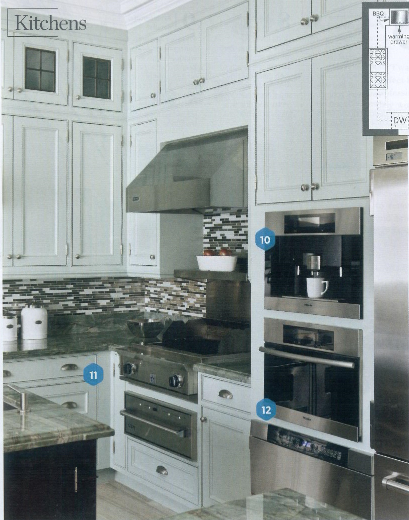
10. Crave your morning coffee?
Linda’s husband, Fred Waks, insisted on a built-in coffeemaker. Their Miele machine is plumbed, but other models can be filled by hand. The built-ins aren’t cheap ($2,000 to $3,000), but may be worth it if you’re a cappuccino addict.
11. How much stuff do you have?
Plan plenty of accessible space for cookware, dishes, and utensils that you use regularly. Linda put deep storage drawers in the island by the stove and also beside the range for storing large pots, pans, and bowls.
12. Do you prepare healthful meals?
Steam ovens are valuable, especially if you fix locally grown fresh foods. The Waks’ Miele Steam Oven seals in flavor and vitamins and cooks most food in less than 20 minutes.
LINDA WAKS
Linda Waks is learning much more than how to make a béchamel sauce at the professional chef’s classes she attends at a Toronto, Ontario, college. The Canadian mother of four also now knows how to lay out and organize a kitchen that is as efficient as it is beautiful.
When Linda began the process of renovating the kitchen of her family’s 1920s home in Toronto, she focused first on function. “Everyone kept asking me what the kitchen was going to look like, but I hadn’t really talked about materials yet,” Linda says.
“I was more obsessed with creating the perfect layout.” She was so successful that professional chefs were blown away when they worked in her kitchen for a charity fund-raiser. “They said they’d never seen a home kitchen set up to function so well and so much like a restaurant kitchen,” Linda says. “It was the nicest compliment anyone could give me.”
Linda consulted with Canadian architect and designer Dee Dee Taylor Eustace to renovate the 380-square-foot kitchen and breakfast room, as well as overhaul several adjoining spaces.
“The exterior is Georgian with Tudor details, so we went with traditional framed cabinets and exposed hinges,” Eustace says. Existing bulkheads were removed, and cabinets now stretch to the 12-foot high ceilings. Leaded-glass door fronts on some upper cabinets-and X-motif trim on the end panels of the two islands—also are inspired by the house’s period styling. “I like that about traditional architecture,” Eustace says. “You can look to the past and reinterpret details so a new style is born.”
A gorgeous blue-green quartzite stone with rich veining jump-started the room’s color palette. The stone was used for the countertops and also as inlays to accent the honed limestone floors in the kitchen, breakfast room, and adjoining foyer. “It provides a continuity all the way through the house,” Eustace says.
Cabinets were painted whisper blue, a color Linda admired in a favorite candle. “We had the paint custom mixed to match the candle,” Linda says. “It’s a very soothing, pleasant color.”
While Eustace fine-tuned the palette, Linda selected appliances that suited her serious cooking style. She installed two pro-style gas ranges (30 and 36 inches) side-by-side to create a 66-inch-wide cooking wall. “That way I have eight burners as well as a ‘flat top,’ where I can fry burgers or do pancakes or stir-fry,” Linda says.
The 36-inch oven is wide enough for catering trays when needed for large parties, and a stainless-steel shelf under the hood is warmed by restaurant-style heat lamps that keep foods hot until they are served.
The Waks like to grill year-round, so Linda installed an indoor grill cooktop with vent hood. “The grill is off to one side rather than next to the stoves because it’s not something we use often,” she says. The arrangement also creates counter space for prepping on both sides of the grill.
Linda’s hands-down favorite appliance is the glass-door refrigerator. “I just love the way it looks,” she says, although her family accuses her of being overly vigilant about how foods are arranged inside. Glass containers help that effort. Soda, beer, and wine are kept in an under counter refrigerator in one of the islands.
Linda was adamant about replacing the existing single island with two smaller ones. “I always had to walk around the island to get from the sink to the refrigerator,” she says. Having two islands with a path be tween allows for easy movement and better organized work zones. The island by the cooking wall is for prep, while the one closest to the breakfast room is used primarily for serving and snacking.
Two jewellike fixtures illuminate the pathway between the islands. Additional lighting is provided by recessed ceiling fixtures that are dimmable to suit activities, from prepping to cleanup to entertaining.
“We wanted the kitchen to have a traditional feel but with a modern twist, Linda says. “I didn’t want it to feel like a commercial kitchen.” Just work like one.
DESIGNER PROFILE
Dee Dee Taylor Eustace
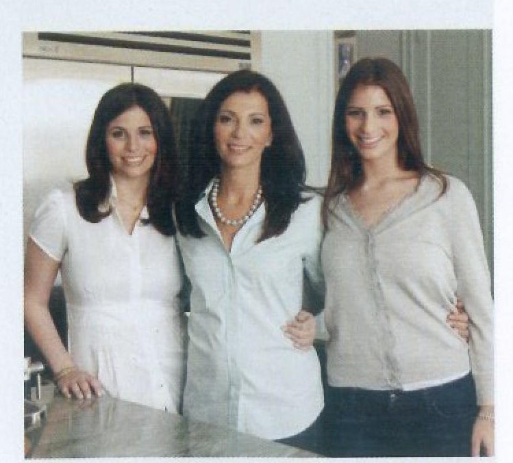
Classical architecture is at the core of Dee Dee Taylor Eustace’s work, but usually with a fresh attitude. Eustace (right, with Linda Waks)
started Taylor Hannah Architect Inc. in Toronto, Canada, in 1992, doing high-end residential architecture and interior design, A TV natural, Eustace appears regularly on The Steven and Chris Show in Canada and has been on The Oprah Winfrey Show three times. She also writes a design column for The Globe and Mail, a Canadian newspaper. Next up? An HGTV reality show, The Real Designing Women, with New York designer Amy Lay and Los Angeles architect Lori Dennis. It’s due to air this fall (taylorhannaharchitect.com).
